Freelance art & creative direction and design for bold brand identities and experiences. Products and interfaces you are excited to touch.
Anything but regular.
Never no amore.
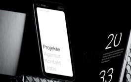
Landesmuseum Oldenburg
Identity & digital ecosystem
Freelance art & creative direction and design for bold brand identities and experiences. Products and interfaces you are excited to touch.
Anything but regular.
Never no amore.
Landesmuseum Oldenburg
Identity & digital ecosystem
What if the brand gets a little out of step over the years?
2021
Creative Direction, Art Direction, Design & Digital Lead.
Then we compose harmony and rhythm back into the brand’s architecture again.
For over 25 years the Heidelberger Frühling is one of the most important magnets for talents and artists in the classic music scene.
These 25 years you can also see in the brand architecture with all their events, formats, sub-brands and institutions.
So the challenge was to make the house again look like all the residents are members of the same family.
Me and the Team of Heine Lenz Zizka came up with an easy to handle visual system of lock ups, grids and patterns that can be generated with specially developed simple tools. So even product managers and non designers can generate a new format and the visual communication for that easily and independently.
To avoid confusion we renamed the umbrella and reserved the name for the festival. The location 'Heidelberg' also remains fixed across all lockups, while the specifications above are allowed to dance.
The playful system is ideal for fine-tuning the rhythm and volume of each media and format while being slick on brand.
(Pitch)
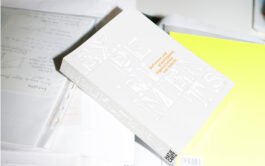
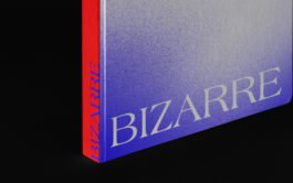
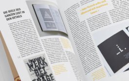
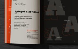
Experiments in type and typesetting.
2015
Art Direction, Design.
In 2015 I was asked to design the key visual and the cover for an experimental typesetting publication.
Scientific and playful at the same time I ended up overprinting different types of type which also worked nicely in motion on displays.
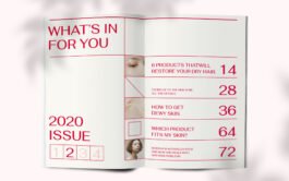
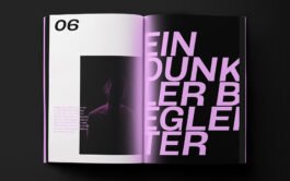
Gaining confidence with a bold design language!
2019
Art Direction, Design.
Many individuals experience a fear of speaking in public, whether in front of a large audience or even in smaller group settings. This fear can be paralyzing and hinder personal and professional growth.
It's possible to overcome it with persistence, practice, and the right strategies. Together with theiss publications I did the art direction for a progressive and loud book about that topic. Even if it’s a topic some people might want to hide it was our goal to make it look like a coffee table book.
This book tackles the issue with calm and ease. In a smooth way people can get walked through preperation, visualization on to relaxation techniques to become a more confident and effective speaker.
The experimental layout gets more tidy with each page. Like the thoughts of the affected reader should become increasingly clear while reading along this book.
When years build a blurred house for one of germany’s biggest publishers?
2019
Brand Architecture & System, Art Direction, Design.
The team at Edenspiekermann and me had to sharpen the DER SPIEGEL brand architecture and came up with a clear new personality and a consistent visual language.
Together with their product managers we also fighted for the consistency happening on the magazine’s covers and killed the lock up’s bulky dropshadow.
After a powerful process we sealed the new brand personality with a logic design system in an all new brand book
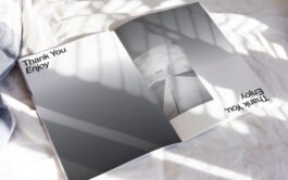
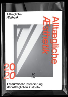
A photographic celebration of the ordinary.
2020
Creative Direction, Art Direction, Design, Photography.
'Everyday Aesthetic' is a photo book that invites you to see the extraordinary in the ordinary. In a world that often rushes by the beauty of the mundane, this book serves as a visual love letter to the everyday moments that surround us.
Each page of this book is a testament to the artistry of life itself.
The book showcases the aesthetic wonder hidden in the ordinary, transforming a routine morning coffee into a masterpiece and a simple stroll through a park into a visual symphony.
This book is published by myself. The photography and the layout of the book is both my handwriting. It's my invitation for you to view the world with fresh eyes and an open heart.
Fresh and daring – like the collection itself!
2017
Art Direction, Design.
For marcelli’s collection 'borderline bizarre' at weimar biennale I was asked to design the visual language and the cover of the catalouge.
Back then grainy gradients weren’t all over the place.
Fresh and daring – like the collection itself!
2017
Art Direction, Design.
For marcelli’s collection 'borderline bizarre' at weimar biennale I was asked to design the visual language and the cover of the catalouge.
Back then grainy gradients weren’t all over the place.
A visual journey through the taste of bustling streets of spanish cities.
2016
Creative Direction, Art Direction, Design, Illustration.
In the heart of Spain's wine country, there exists a bottle that held not just wine, but an entire symphony of flavors. This exceptional creation, known as Toro Loco Tinto Semidulce, was like a tapestry of Spain's rich and vibrant landscapes woven together with every sip.
According to the art of vinification brings an ensemble of flavors that dance upon the taste buds, no less than blackberry, sour cherry, black currant, mint, lemon balm, eucalyptus, and even a hint of chocolate. As if the essence of Spain itself had been bottled.
The label adorning the bottle was a work of art in itself, capturing the spirit of Spain in a playful yet captivating design. It portrays the facets of Spain, each as charged and vibrant as the wine's taste. From the culture to the bustling streets of Spanish cities, it is a visual journey that mirrored the experience of savoring the wine.
But what truly set this light-footed red wine apart was its immensely silky texture. It caressed the tongue like a gentle breeze, leaving a trail of enchanting flavors that lingered, creating a good reverberation, like the sweet echoes of a Spanish guitar in the distance.
With every glass, this wine brought joy and delight. It is a celebration of Spain's rich heritage, a journey through its varied landscapes, and a harmonious blend of flavors that danced together like a passionate flamenco performance.
It is the kind of wine that made you fall in love with Spain all over again, one sip at a time.
A wine that is fun to drink.
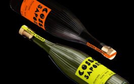
So independent and different, yet clearly recognizable as one series. Almost like siblings, no?
2016
Creative Direction, Art Direction, Design, Illustration.
An Italian winemaker who enjoys his own wines the most, took the opportunity in 2015 to create a new series of wines. This series consisted of a trio of modern drops: red wine, white wine and rosé. Each of them was unique in taste, yet connected to each other.
To me, it almost sounded like the man had created his own children, so much did he appreciate the uniqueness and diversity of each of them.
The man appreciated the uniqueness and diversity of each wine so much that it almost sounded to me like he was talking about his own children.
That's why I came up with the idea of treating the wine like siblings.
Therefore I designed abstract portraits in clear geometric shapes that still somehow captured the essence of each wine in a striking way. The portraits were supported by the names of the wines, all of which had a double meaning. Each name was an allusion to the unique taste experience each wine offered.
These wines were a form of artistic expression that appealed to both the senses and the soul. Each sip was like a journey into the world of the winemaker, a party for the senses and a celebration of the art of winemaking.
And so this wine trio series lives on, as an ode to a winemaker's love for his wines and a gift to all who appreciate the pleasure of pleasure and the beauty of wine.
A duet of distinction:
crafting uniqueness in every sip. And in every letter.
2015
Art Direction, Design, Typography.
A duet of two individualists, aimed at the discerning wine connoisseur of handmade drops: A heavy and noble red wine, full of depth and character, and a tangy and fresh Vinho Verde that embodied lightness and independence. In a world where mass production was the rule, this duo was to break ranks.
The vision was clear:
as pure and unadulterated as the origin of each drop and yet individual, as if each sip were a handmade creation.
The label had to be like that, too!
To illustrate this balancing act between heaviness and lightness, I resorted to pen and oversized ink. Each letter of the name reflected the unique essence of both wines. Sweeping and exciting curves united with solid, down-to-earth swells.
A glossy black that reflected the depth and maturity of the red wine was accompanied by bright, vibrant colors. These colors were the game partners that brought to life the lightness and independence of Vinho Verde.
A mouthful of dancing bulls!
2015
Creative Direction, Art Direction, Design, Illustration.
This exquisite red wine hails from the enchanting Spanish region of Toro. Its mere mention sparks vivid imagery of the magnificent bull, a symbol of strength and charisma. However, the true magic of this wine unfolds with each sip, as it beckons you into a captivating dance of flavors that truly feels like a wild gang of bulls joyously prancing across your taste buds.
It's a party in your mouth, a symphony of flavors that sets your senses on a thrilling journey. The wine's luscious, full-bodied character is an open invitation to savor its fine fruity notes, creating a sensory experience that's nothing short of magical. The exquisite touch of barrique adds an element of sophistication to this already delightful creation.
The wine's appearance is as striking as its taste, boasting an intense and dense cherry red hue that captures the essence of its bold and dynamic personality. The label is a perfect reflection of the wine within, as it shines vibrantly in bright red, adorned with a playful yet enigmatic pile of bulls. Amidst this jubilant display, you might notice the nose rings of the bulls, their glinting adding a touch of mystery to the label's design.
And so, this remarkable wine derives its name from the captivating nose rings, or "anillos," that adorn the bulls, a fitting tribute to the joyous spectacle it presents in every glass. With every pour, you embark on a journey that's as spirited and vivid as the Spanish traditions it celebrates, making it a true delight for both the palate and the imagination.
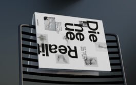
Will there be a new reality? Not a metaverse but what?
2016
Cover Design.
The new collection 'Die neue Realität' of gido van dayg from 2016 was exactly asking these kind of questions.
What will be reality in 10 years? How will an identity feel like?
Glad I was asked to design the cover of the catalouge and the key visual of the exhibition of the collection.
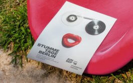
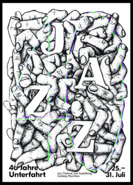
A jazz club turns 40 – but it’s still about the jazz, isn’t it?
2016
Art Direction, Design, Illustration.
Good music, talented artists, dancing people and – of course – moving fingers.
This is jazz.
I drew the poster for Unterfahrt Munich back in 2016 on stone to print a whole stack of it with lithography.
On top of the black litho-layer I screen printed a subtle 40 in two contrasting colors.
Here you go.
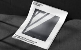
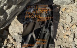
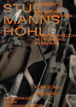
Showing a cave without showing a cave?
2018
Creative Direction, Art Direction, Design, Photograms.
For the Sturmannshöhle in the south of germany I developed a new visual language for their communication. Of course the goal was to become more modern and interesting for a younger audience as well. They want to show that they are a cave without showing the cave itself. I came up with more explorative visuals people can discover like the cave itself.
So I ended up with some experimental photograms as key visuals. I took different objects and patterns to the darkroom and put them under the enlarger.
The final photograms show glass-like fictitious stone structures and at the same time show a kind of depth that seems surreal.
Can we go back to the roots without being lame?
2018
Art Direction, Design, Photography.
In 2018 I was again designing the Poster for the dok. fest. A documentary film festival in munich. In 2018 we wanted to go back to the roots but still in a modern way of course.
I was thinking of an analogue way with nice color contrasts while also setting type by hand.
One option out, the other elements must push even more.
2017
Art Direction, Design.
In 2017 the silent film festival in berlin again reached out to collaborate on their visual identity for this years campaign.
Our goal was to show the minimalism of silent film in the same minimalistic but specific way on the posters. Very reduced but more with strong focus on the typography.
Coming in positive and negative we still had a very nice and playful pattern for the SLNC special in the whole city.
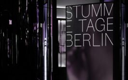
An image style that shows the quietness.
2016
Art Direction, Design, Photography.
The first time I had the pleasure of working on the visual language of the silent film festival was in 2015, and the idea was to create images that would show the non-speaking properties on their own.
For more information, it took a little more engagement with the medium - just like for the stories context of a silent movie.
The image style was created on a very large scanner showing parts of the human body showing gestures.
Movies where talking is not allowed and posters that show that no one’s speaking.
2018
Art Direction, Design, Photography.
Again in 2018 I was asked to design a poster for the silent film festival in berlin. It should be loud while showing that it's about silence. And a little provocative and cheeky so it doesn't appear like the image of old and dusty silent movies.
Movie.
Film.
No words.
Easy!
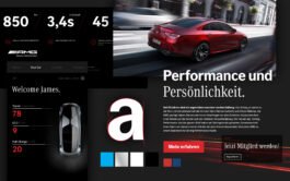
Highest quality is allowed to play as well.
2019
Creative Direction, Art Direction, Design & Digital Lead.
NANI skin care products are of highest quality. This should not only be reflected visually but in the entire brand experience.
The visual language is both clear and strong but with a twist.
The brand feels slick — whoever decides on a NANI product has already made the decision before visiting the website. Digitally, therefore the focus is on finding and ordering the already chosen product with ease.
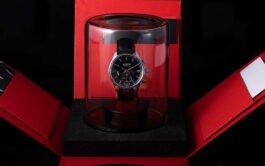
A new leica is born.
2022
Creative Direction, Art Direction, Design, Market implementation.
Born where it all began. The darkroom.
Because it’s always been about time.
The 'who', the 'what' and even the 'how' for the new Leica watch series was clear way before market launch. So the biggest challenge was to communicate the 'why'.
Why is leica building a watch? Why now? Why a mechanic one when there are smart watches all around?
The whole community was already asking these questions and posted some skeptical comments when there were first rumors.
We had to give an answer: It’s always been about time! It’s always been about finding the right moment, it’s always been about exposure time and it’s always been about counting down in the darkroom . This leica just don’t use film or photo paper. But it‘s still born where it all began. The darkroom.
It’s a leica.
(pitch)
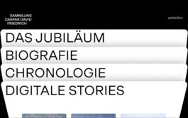
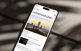
Exploring 250 years timeless horizons.
2023
Creative Direction, Art Direction, Digital Lead, User experience & interface design.
In a collaborative effort involving the 'Hamburger Kunsthalle', the 'Alte Nationalgalerie Berlin', and the 'Staatliche Kunstsammlung Dresden', I had the opportunity of orchestrating the 250th anniversary celebration of the renowned artist, Caspar David Friedrich, in partnership with Heine Lenz Zizka.
Our mission was clear: to craft a visual narrative that not only paid homage to the master of the horizon, Caspar David Friedrich, but also seamlessly intertwined with the three iconic museums.
The journey from yesterday to tomorrow was evident in our design language. We drew inspiration from the crisp gradients that mirrored the luminous horizons of Friedrich's masterpieces, infusing our project with the needed dynamic.
Our focal point was the creation of a digital masterpiece, a platform that went beyond showcasing his artworks and basic biographical information. It’s about an immersive experience, featuring interactive dives into the profound background stories of specific works. This was no ordinary digital collection; it catered to a diverse audience, from art philistine to seasoned researchers.
Our approach therefor had to be both informative and inspiring. It was about transforming the conventional exhibition into a journey of discovery, where visitors could dive deeper into the intricacies of Caspar David Friedrich's world. In doing so, we honored his artistic legacy and invited everyone to be a part of this remarkable 250th-anniversary celebration.
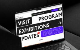
An agency that wants to look more digital at first sight.
2022
User experience, Art Direction, UI Design & Digital Lead.
As you know a new website for a design agency is one hard process. For Heine Lenz Zizka i developed a more digital new design language to show tell that the known print agency also has developed for a more interactive now.
We not only scaled up the images and font size but also implemented some more moving modules. Instead of the known show reels I introduced a simple moving feed which can easily be updated in the backend. The lucky – now they don’t need to re-produce a new show reel every year.
Their cases now can be experienced as a visual feed because the long reads are now collapsed in deep dives for the most interested ones only.
With a all new about section they now can show who they are and what they do. And why they do it.
Such great things nobody knows about, they needed a biiiig insights section. Have a read-along about their engagement and self initiated projects.
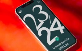
A hybrid component library for more than just different screen sizes.
2023
Creative Direction, Digital Lead, user experience.
The Volkswohnung Karlsruhe has understood the urgency of transformation. The new annual reports should be expierenced in the digital world. Connected stories, deep dives, all kind of media, you name it.
However, the submission in PDF format is mandatory.
And holding something nice in your hands would be cool, too.
But maintaining three annual reports twice every year?
Together with Heine Lenz Zizka, we developed a hybrid design system that includes a component library that serves more than the usual viewports. With the hybrid library, responsive is more than just different screen sizes.
The Volkswohnung components now include the primitives for their behavior in a printable DinA column width. So the reports can be maintained via the usual CMS and are generated live and for all viewports as well as a printable PDF format.
And yet the layout does not have to hide. Sweet, right?
Within thumb's reach, accessible for everyone from anywhere and at any time.
2021
Creative Direction, Art Direction, Design & Digital Lead, user experience & interface.
Whether you’re a student or a grandma, from here or far away, regardless of native language, special needs, large or small budget: the Volkswohnung karlsruhe wants to give everyone access to a home. And to do so it needs to be as uncomplicated and inclusive as possible.
This was the approach for a holistic transformation process that we developed with the team of HLZ. Workshops on user journeys and their needs revealed the great diversity of the target group. From existing tenants and owners to people interested in renting, buying, and building, the demands on Volkswohnung's digital service are very diverse. A holistic user centered approach therefore characterizes now the entire digital ecosystem, including the new website. This enables user specific and inclusive access for all visitors.
The center of the new digital products is a flexible and scalable design system that allows to put out new products and formats quickly and optimized for all devices.
The design system grows with consistency and without any problems! Color, typography, icon and image language, illustrations - a construction kit of clear elements that can be combined to create all the modules you need, with a focus on ease of use and accessibility.
Within thumb's reach, accessible from anywhere and at any time: This is the new website of the Volkswohnung.
Logical and learned UI patterns meet moving visualizations, the clear structure offers needs-specific entries and different levels of content depth.
Dialogical components support orientation within the website and create digital proximity. In this way, Volkswohnung now also provides the same good advice, transparency and social responsibility online that tenants and prospective tenants are familiar with from their previous support
Shifting and lifting germany’s biggest art museum.
2022
Creative Direction, Art Direction, Digital Lead.
In the wake of the COVID-19 pandemic, museums around the world have awakened to the pressing need for a digital product. In collaboration with HLZ, we embarked on a transformative journey with the Hamburger Kunsthalle.
Through a series of insightful workshops delving into the minds and desires of users, refined the museum's identity, and fine-tuning its tone, we set out to craft something extraordinary. What emerged was a digital product that not only pushed the boundaries but also breathed new life into the museum's established design language.
Beginning with compact screens, we wove a narrative rich with clarity and excitement, firmly grounded in a user-centric approach. Our mission was clear: to break away from the tradition of exhibitions dominating the first viewport for months on, leaving returning visitors with a sense of stagnation.
With an audacious and captivating introduction and an array of narratives that vary in speed and depth, the Hamburger Kunsthalle's website ceased to be a mere appendage to the physical institution. It transformed into an independent digital museum space, an immersive journey in its own right.
In addition to this digital transformation, we gifted the Hamburger Kunsthalle an elegant and versatile design system. This system empowers them to seamlessly and consistently navigate through the digital landscape, ensuring a harmonious and engaging experience for all who step into their digital realm.
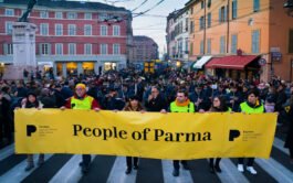
What if the cheese is better known than the city itself?
2019
Brand Strategy, Art Direction, Design, Brand System, Digital Ressource Kit.
It needs an identity that brings together the various elements of the city's history, culture and future, even beyond 2020. It needs a visual language that not only attracts tourists!
With the »P« as the keyhole to the city everyone can discover Parma with his own view.
Together with Erik Spiekermann we approached the matter like an Italian dish. It only requires a few, but excellent ingredients to prepare a delicious dish.
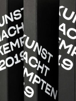
A brand without a logo?
Works!
2018
Creative Direction, Art Direction, Brand Strategy, Design.
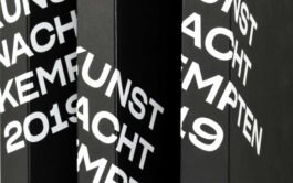
If you look at branding projects from the cultural sector, they usually appear sterile and elitist. However, the »Kunstnacht Kempten« immediately reminded me of Brian O’Dohertys’ »Inside the White Cube«.
That’s why we understood it as our task to get the art in Kempten out of its shell and bring it to the outside world — to the middle of society.
With the new look, we are taking art off its pedestal and bringing it to the corners of the city. At the same time, we are bringing the studios back into focus and decentralising the event.
The result is a future-oriented, strategic concept that maximises the potential of a city cultural event in the long term.
A brand without a logo?
Works!
2018
Creative Direction, Art Direction, Brand Strategy, Design.
If you look at branding projects from the cultural sector, they usually appear sterile and elitist. However, the »Kunstnacht Kempten« immediately reminded me of Brian O’Dohertys’ »Inside the White Cube«.
That’s why we understood it as our task to get the art in Kempten out of its shell and bring it to the outside world — to the middle of society.
With the new look, we are taking art off its pedestal and bringing it to the corners of the city. At the same time, we are bringing the studios back into focus and decentralising the event.
The result is a future-oriented, strategic concept that maximises the potential of a city cultural event in the long term.
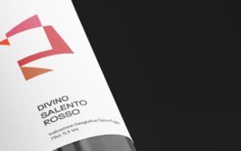
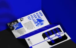
2018
Art Direction, Design.
A graphic pattern that strongly connects the wine series. And also reads “LAVA”.
In cooperation with Gourmondo, a series of wine labels was to be created that would be immediately recognizable as belonging together. In addition, a graphic pattern was to be created that would also be used and recognized on product boxes and other media.
The flow and location of the word "Lava" should of course not go unnoticed.
Cheers! Lava!
A graphic pattern that strongly connects the wine series. And also reads “LAVA”.
2018
Art Direction, Design.
In cooperation with Gourmondo, a series of wine labels was to be created that would be immediately recognizable as belonging together. In addition, a graphic pattern was to be created that would also be used and recognized on product boxes and other media.
The flow and location of the word "Lava" should of course not go unnoticed.
Cheers! Lava!
Same approach, endless new perspectives and ways.
2018
Creative Direction, Art Direction, Design & Digital Lead.
In 2019, the design world celebrated the 100th anniversary of one of the most influential movements in modern design history – the Bauhaus.
Movement also played a big role in the location of the Bauhaus. At that time the school was moved from Weimar via Dessau to Berlin.
So it was important to us to reflect this dynamic and also the continuous change in the brand identity.
Craftsmanship and technology create a new vision of design that transcends traditional boundaries. The enduring power of the Bauhaus movement in infinitely new forms and perspectives. This game finds its place in our logo system and all formats layout grids.
The dancing zeros of the hundred simultaneously represent the different platforms for discussion, the Bauhaus principles, exhibitions, interactive experiences, intellectual discourse and innovative design.
The anniversary should be just the beginning – the starting point – for future generations of creatives and designers.
When you have two of the most famous fonts to differentiate five brands more clearly?
2018
Art Direction, Design.
We really need to go into the details.
For Mercedes Benz and Daimler, I worked with the team of edenspiekermann on defining the typographic nuance of the Mercedes Brands.
In several workshops, together with the client we developed and sharpened the design attributes and the positioning of the individual brands.
The end result was not only clear guidelines for font hierarchy of the brands, but also a nerdy font optimization for screens and a global market.
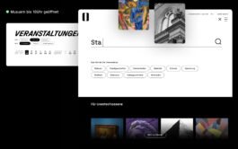
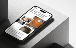
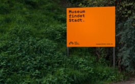
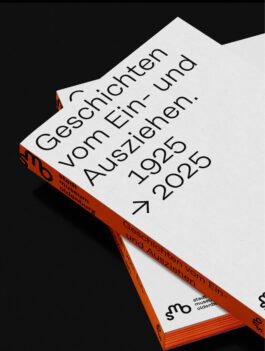
What if a museum’s without a home for next 3 years?
2021
Creative Direction, Art Direction, Design.
The museum must take place outside – in the city. Therefor it was almost ovious what was next for the Oldenburg City Museum: we simply use the original objects of the city. On a scale of 1:1.
Inspired by the signal colors of construction work, I worked with the team of Heine Lenz Zizka on cover the whole city of Oldenburg in orange. One color, one typeface and great stories on information boards directly next to the city's attractions.
The clear language not only has a huge recognition value, but can also be expanded quickly and easily by anyone. Orange tape for an arrow? That can already work as a way finding. An orange graffiti says here is happening some kind of exhibition? Why not?
How nice, that the clear and playful visual system fits perfectly into a city museum’s budget.
The digital ecosystem not only provides me an overview of the city exhibition, but also stores deep dives and makes it easy to plan my tour.
Plus, of course, it provides the latest news on the construction status of the hometown.
We also used the campaign directly as a transition into a new visual identity. What will the Oldenburg City Museum look like from 2023?
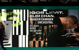
A museum that had no home for 3 years.
2021
Creative Direction, Art Direction, Design & Digital Lead.
Of course, wants to announce the opening again with a bang.
Using the basic elements of the campaign and sharpen them, the new city museum sprays around with clarity and dynamics.
The architecture and the curves of the logo always there, the new SMO shows a clear facade. As soon as you open the door just a little, the magic and inner life of the art and stories immediately shines out.
In the visual communication, we again used our signal orange, which already ensured recognition in the construction campaign. The fonts both are from the same family. While the campaign works with a bold and bulky monospaced, the identity got the readable and screen optimized version of René Bieder’s Rational.
Crafting a mindful experience for wellbeing.
2019
Art Direction, UI Design.
In the last years meditation apps to calm us have popped up massively.
The team of inuvia reached out to me and the team at edenspiekermann with another interesting approach: increasing mental and physical body energy on our body’s cell level.
As a team with their product experts we build their brand, and their subscription based products from scratch.
Now it’s not only a supplement anymore — we came up with a personal self test, a digital coach with personalized treatments and workouts and a blog with all the knowledge about our cells powerhouse. A holistic digital experience.
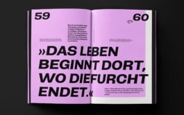
When the castle steals the show?
2021
Creative Direction, Art Direction, Design & Digital Lead.
We need to keep together not only all the aspects of the museum, but also the different houses.
Instead of different rooms or sections the landesmuseum oldenburg has three different houses seperated by a crossroad.
Together with the Team of Heine Lenz Zizka we came up with a whole new bold identity and a visual system that holds together what belongs together.
Inspired by the architecture of the three houses the big O of oldenburg not only works perfectly as brackets, it also looks familiar as a mask for the arts and culture.
The digital ecosystem got covered up by a sweet design system wich makes it joyful to create consistent but playful assets for all channels and devices.